


Using Color in Landscaping
20 March, 2024
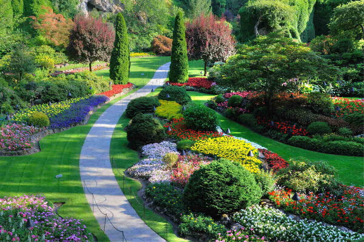
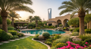
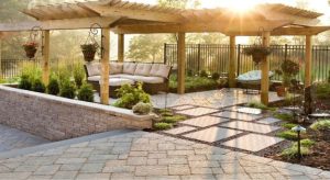
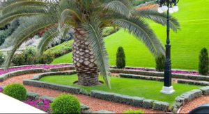
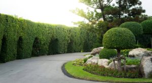
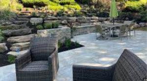
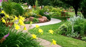
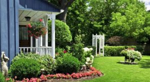
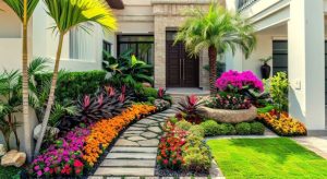
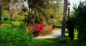
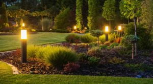
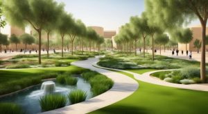
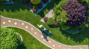
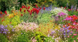
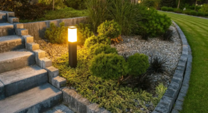
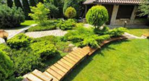
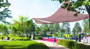
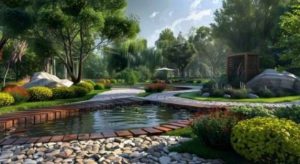
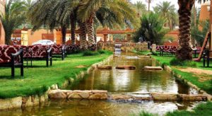
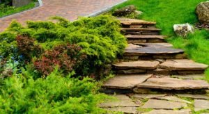
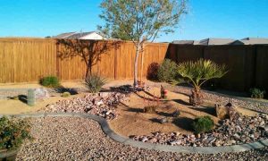
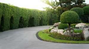
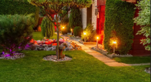
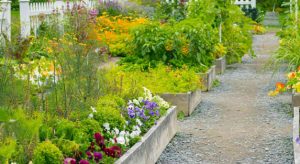
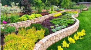
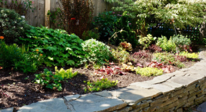
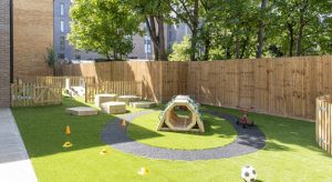
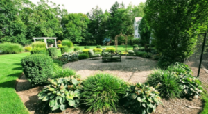
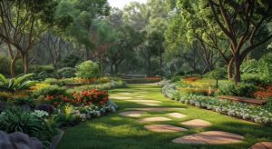
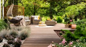
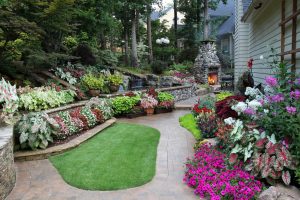
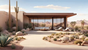
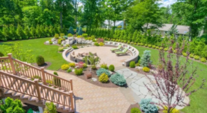
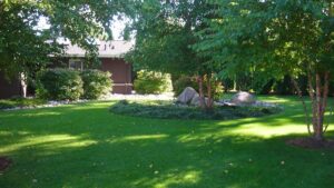
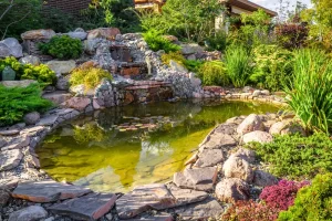
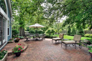
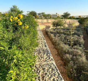
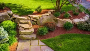
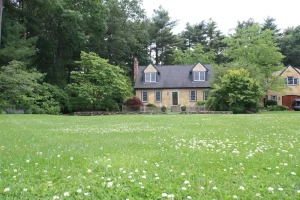
Color in the landscape is one of the most rewarding elements. When working on its intervention, color is one of the most satisfying aspects of the landscape, and it may be the best challenge. The right use of color is crucial since vision is the first sense we use to perceive space, and color influences the observer's mood and comprehension of their current location. Every landscape component has color, which helps build the chromatic synthesis of the landscape picture (sometimes called "environmental color") and gives the landscape a distinct personality.
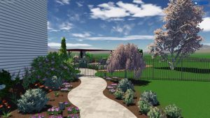
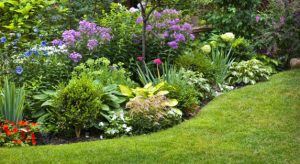
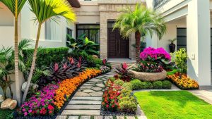
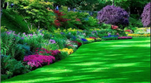
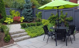
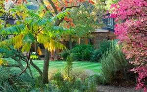
Color establishes the landscape image's character and individuality and plays a role in its construction. It is common knowledge that colors impact our feelings and psychological impacts on our minds. While cool colors like blue and green evoke feelings of calm and relaxation, warm colors—such as red, often associated with danger, or orange, associated with joy—are typically associated with powerful emotions. Warm colors—red, orange, and yellow—tend to catch our attention more when we look at them; in contrast, cool colors—blue, green, and purple—are more neutral and ambiguous and may provide a homogenous environment that gives space depth and significance.
Theory of color
A basic, innate visual attraction is associated with color. "Color is the only experience in life that does not require a conscious struggle of the intellect to be appreciated," according to a color theory specialist. The fundamentals of color theory are as follows: in general, there are three basic colors (red, blue, and yellow), from which mixtures of secondary colors (green, purple, and orange) and tertiary colors are derived. Color is a property of light, as demonstrated by Isaac Newton in the 17th century. Warm and cold hues may be found further down this color wheel. Color theory says that certain combinations of colors result in a harmonious whole.
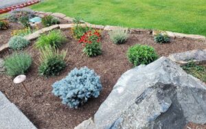
Monochromatic colors
A single hue is used but in varying tones or intensities. Crimson combined with various pinks and a deep crimson or maroon would be an example.
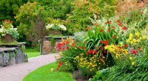
Complementary colors
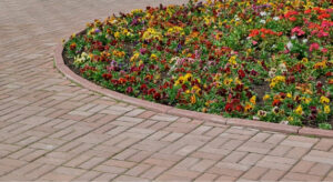
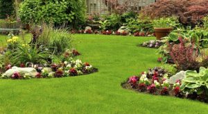
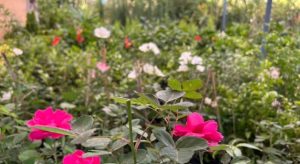
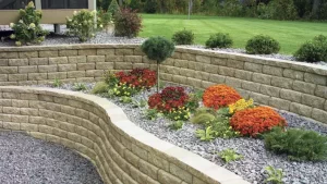
They are opposing hues on the color wheel, so they go well together to form a pair. They make strong, eye-catching pairings in the garden. Combining red and green, orange and blue, and yellow and violet are a few examples.
Analogous colors
These three hues complement one another since they are adjacent to the color wheel. Red-violet, for instance, is adjacent to violet, whereas blue is adjacent to blue-green.
These combo possibilities are simple to accomplish because so many annuals and perennials are available. Selecting three hues that, when combined, create agreement and are equally spaced on the color wheel constitutes tertiary colors. For instance, orange with green and purple, yellow with red and blue, etc.
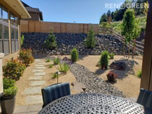
Rules for color design
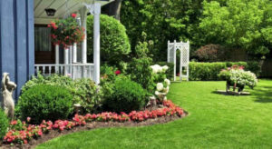
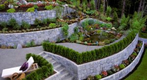
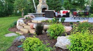
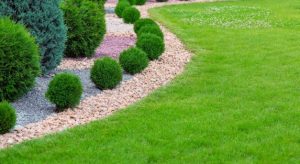
The following fundamental ideas of color design can aid in the planning and creating of a landscape: oneness. It lends a design cohesion. It suggests a consensus among the selected components. Using plants with similar features as the foundation for the design—for instance, plants with the same size, color, and kind of leaf, plants with similar appearances, etc.—will help create unity in the design.
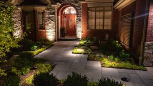
Focal points.
They are focal points that contrast and set themselves apart from the other plants; they are the antithesis of oneness. They can be architectural, like a sculpture or fountain, or natural, like a peculiarly shaped or colored plant, and they all draw attention to one particular area.
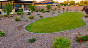
Equilibrium.
The visual weight is distributed equally. To establish balance in formal design, we position a distinctive element precisely the same on one side as the one on the other. Asymmetrical garden design can also be achieved by utilizing contrasting plants or colors on one side to counteract visual weight and give the eyes a break.
The following effects may be achieved with the color in landscaping:
- Establish a specific tone.
- Draw attention to key locations that you want to draw attention to (a front entrance, walkway, etc.).
- Bring the entire design together.
- Balance the hues of other plants.
- Draw in wildlife, including butterflies and birds.
- A garden or esplanade's layout should be balanced.
- Adjust an outside area to the overall environment.
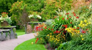
Harmony of colors
When we explore or perceive a landscape, color combinations can either have a harmonic impact or be a series of conflicting tones that cause shifts in our mood. A nice arrangement of components, whether in poetry, music, dress, or even food, is called harmony.
A visually pleasing aspect of experiences is harmony. It captivates the audience and establishes a sense of balance and internal order throughout the watching experience. When something is not harmonic, the observer often rejects it because it is monotonous or disorganized. A visual experience might be so overwhelming and chaotic that it is hard to look at or so boring that the viewer will not interact with it (since the brain will reject uninteresting information).
You Can Read Also: 10 Evergreen Trees Perfect for Small Gardens
- Fountain and Waterfalls
- Gardening
- hardscape
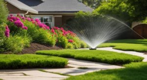
- Irrigation system
- Landscape
- Lawn
- Nursery
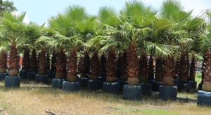
- Palm Tree
- Plantation and Maintenance
- softscape
- Tree Transplanting
- Washingtonian Tree
Categories
Latest Post


- Fountain and Waterfalls
- Gardening
- hardscape
- Irrigation system
- Landscape
- Lawn
- Nursery
- Palm Tree
- Plantation and Maintenance
- softscape
- Tree Transplanting
- Washingtonian Tree